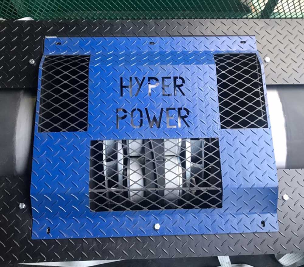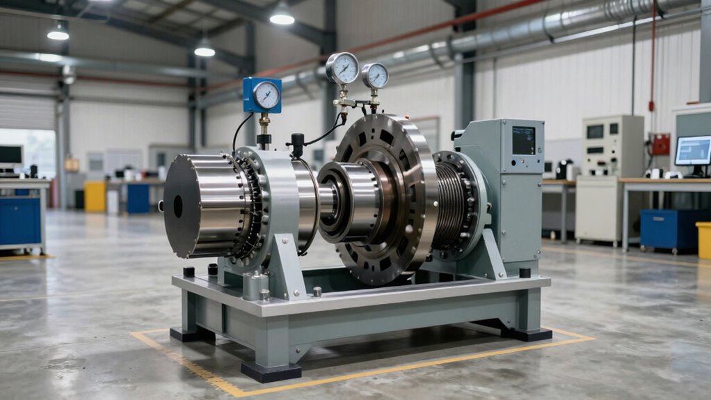
Hub Dyno Installation: Critical Space Requirements
Most hub dyno installations fail before they’re even tested. Learn the exact space requirements that separate functioning setups from expensive disasters.
Accurate analysis of dynamometer data relies on a profound comprehension of the graphical representation of an engine's power and torque output.
A thorough grasp of the axes, curves, and rev range is crucial to decipher the wealth of information hidden within the graph.
Recognising the significance of a baseline, correctly reading the axes, and considering factors like atmospheric conditions and transmission type is critical to optimise the insights gained from dynamometer data.
As you gain insight into the subtleties of dyno graph analysis, you will discover the secrets to releasing your vehicle's full potential.
A thorough comprehension of the visual representation of a vehicle's performance is crucial for accurate analysis.
A dyno graph is a precise tool that displays a vehicle's power and torque output, enabling experts to gain valuable insights into the engine's behaviour.
The graph typically plots power in kW and torque in N against road speed in km/h, providing a clear visual representation of the vehicle's performance.
Peak power numbers are recorded from each power run and displayed on the graph, offering a precise measurement of the vehicle's maximum output.
The red and green lines on the graph indicate after-tune and before-tune power, respectively, making it easy to compare the effects of modifications.
Furthermore, the graph may display pressure or air-fuel ratio, providing further insights into the engine's behaviour.
Grasping these components enables experts to accurately analyse the dyno graph, revealing the full potential of a vehicle's power and torque.
A dyno graph's visual representation of a vehicle's performance is only as valuable as one's ability to decipher its diverse components.
To effectively analyse dynamometer data, it is crucial to break down the dyno chart elements. The X-axis represents engine speed, measured in revolutions per minute (RPM), while the Y-axis represents engine power, measured in horsepower (hp).
The dyno graph curves represent power and torque, with the torque curve being fairly consistent and the power curve climbing steadily.
The rev range (RPM range) is the range on the graph where the lines begin and end, indicating the engine's operating range.
The powerband is the range on the graph between peak torque and peak power, representing the engine's most efficient operating range.
Peak torque is typically found at the moment on the graph when the torque curve climbs up and breaks into a flat curve, indicating the engine's maximum twisting force.
Grasping these elements provides valuable insights into a vehicle's performance and enables data-driven decisions to optimise its potential.
Accurate interpretation of dyno results is vital to reveal the full potential of dynamometer data.
To achieve this, it is imperative to understand the limitations of dyno graphs, recognize the importance of a baseline for meaningful comparisons, and correctly read the axes on the graph.
Dyno graph analysis is a crucial step in extracting valuable insights from dynamometer data, as it enables engineers to visualise and quantify the performance characteristics of a machine or component under test.
This process involves examining dyno graphs, which provide a visual representation of power and torque output across a specific rev range. Through analysis of these graphs, engineers can identify trends, patterns, and anomalies that may indicate optimal operating conditions or areas for refinement.
A thorough analysis requires consideration of different factors, including the ramp rate at which the machine was tested.
A skilled dyno operator adjusts the ramp rate to simulate real-world operating conditions, ensuring the data accurately reflects the machine's performance. Engineers can extract valuable insights from careful examination of the dyno graph, informing design improvements, optimising performance, and boosting total efficiency.
Accurate analysis of dyno graphs is critical to making informed decisions and driving innovation in machine design and development.
Engineers interpreting dyno results must navigate a complex landscape of data, where subtle variations can significantly impact the accuracy of their inferences.
Accurate interpretation relies on understanding the graphs and power figures they present. A dyno sheet without a baseline is meaningless, as every dyno reads differently, and every operator generates data in a unique way.
The Peak Torque is typically found at the moment on the graph when the Torque Curve climbs up and breaks into a flat curve, indicating the engine is at peak efficiency.
The Rev Range is the range on the graph where the lines begin and end, and the Powerband is the range on the graph between Peak Torque and Peak Power, where the vehicle feels the most powerful.
Torque gains are what drivers feel when accelerating, making the car feel more powerful, and the Power Curve climbs at a 45-degree angle until tapering off, indicating the engine's ability to produce power.
Consistency in testing conditions, such as temperature, humidity, and tyre pressure, is pivotal to ensuring accurate and reliable dyno results.
A dyno graph contains a wealth of information that reveals the subtleties of a vehicle's performance, beyond the headline-grabbing peak power figures.
The curves and numbers on the graph provide insight into how the vehicle will feel to drive. Comparing two graphs side by side shows how one will perform compared to the other, with peak power and peak torque figures often displayed to demonstrate differences.
The shape of the torque curve should be smooth, with no big bumps or dips, indicating how the engine will respond.
The engine speed at which peak torque and peak power occur reveals information about turbo spooling and responsiveness. A wide spread of torque and power indicates a drivable car with usable performance.
It is vital to read the axes properly to ensure correct interpretation of the graph. Note that a dyno graph is only as useful as the tuner interpreting it, and be aware that graphs can be smoothed or manipulated, affecting accuracy.
Effective analysis of a dyno graph provides valuable insights into a vehicle's performance.
When evaluating dyno data, it is imperative to recognise that the accuracy of the results relies heavily on the quality of the testing procedures and the expertise of the tuner interpreting the data.
To avoid misinterpretation, it is pivotal to understand that every dyno will read differently, and every operator will generate data in a different way. A dyno graph without a baseline is meaningless, and conditions must be consistent between the before and after tests to guarantee accurate comparisons.
Furthermore, it is fundamental to recognise that peak torque is typically found at the moment on the graph when the torque curve climbs up and breaks into a flat curve, indicating the engine's peak efficiency.
A good dyno tuner will be happy to answer questions about their dyno procedures and data analysis, as real-world driving scenarios can be very different from dyno testing conditions. Tuners can guarantee they make informed decisions and avoid misinterpretation of dyno data by using common sense and judgment when evaluating dyno graphs and results.
Dyno testers can unlock the full potential of Hyper Power's software to gain valuable insights into their vehicle's performance.
This is achieved through harnessing the software's advanced features, which reveal a deeper appreciation of their vehicle's power output and torque.
A dyno tester's ultimate goal is to tap the full capacity of their vehicle, and meticulous analysis of dyno data is key to achieving this objective.
Careful examination of the dyno graph reveals areas of improvement such as power losses due to drivetrain components, enabling targeted modifications to optimise performance.
The graph shows the relationship between power, torque, and engine speed, refining engine performance for specific driving scenarios.
Dyno analysis can also reveal hidden issues, such as inconsistencies in the torque curve, which can be addressed through adjustments to engine calibration or component upgrades.
Comparing before-and-after dyno figures quantifies the gains from modifications, such as a 27% increase in peak power, and refines tuning strategies accordingly.
Grasping the relationship between Peak Torque and Peak power on the dyno graph allows tuners to fine-tune their engine for maximum output.
Normalising dyno data and considering factors like atmospheric conditions, tyre type, and transmission type enables accurate comparisons between different vehicles or tuning configurations, ultimately leading to unparalleled performance.
Gaining Insights into Dyno Graph Components
Accurate analysis of dynamometer data relies on a thorough grasp of the graph components. A typical dyno graph consists of multiple plots, including torque, horsepower, and engine speed. Torque plots display the rotational force of the engine, whilst horsepower plots illustrate the engine's power output. Engine speed is typically represented on the x-axis, with the corresponding torque and horsepower values plotted on the y-axis.
Deciphering Dyno Chart Elements
To effectively analyse dyno data, dissect the chart into its constituent parts. Identify the peak values for torque and horsepower, along with the corresponding engine speeds. The shape of the torque and horsepower curves provides valuable insights into engine performance. Moreover, the rate of torque and horsepower increase or decrease can indicate engine characteristics such as responsiveness and acceleration.
Accurately Interpreting Dyno Results
Accurate interpretation of dyno results is critical to informed decision-making. Examine factors such as engine type, vehicle application, and performance goals. For example, a high-performance engine may prioritise peak horsepower, whilst a heavy-duty truck engine may focus on low-end torque. Correct interpretation of dyno data enables the identification of areas for improvement and optimisation. If you have any questions about interpreting dyno results, contact Hyper Power regarding our Custom Dyno Solutions, Installation and Setup, Training and Certification, Technical Support and Maintenance, Software Updates and Upgrades, Diagnostics and Performance Analysis, Rental Services, Dynamometer Testing Services, and Accessories and Parts.
Analyzing Dyno Graphs for Insights
Dyno graphs provide a wealth of information beyond peak values. Analyse the graph shape and slope to reveal engine characteristics such as throttle response, engine braking, and total power delivery. Moreover, comparative analysis of multiple dyno runs can identify trends and patterns, enabling the optimisation of engine performance.
Preventing Misinterpretation of Dyno Data
Misinterpretation of dyno data can lead to incorrect inferences and suboptimal engine performance. Common pitfalls include focusing solely on peak values, neglecting the importance of engine speed, and failing to examine external factors such as atmospheric conditions and dyno calibration.
Efficient Use of Hyper Power's Software
Hyper Power's software provides a thorough platform for dyno data analysis. Efficient use of the software involves leveraging its advanced features, such as data filtering, smoothing, and comparison tools. This enables the extraction of valuable insights from dyno data, facilitating informed decision-making and optimised engine performance.
Maximizing Performance With Dyno Analysis
Dyno analysis is a powerful tool for maximising engine performance. By combining accurate data analysis with a deep understanding of engine characteristics and performance goals, engine tuners and developers can tap the full potential of their engines. This results in improved power output, efficiency, and total performance. If you require assistance with maximising performance, contact Hyper Power regarding our Custom Dyno Solutions, Installation and Setup, Training and Certification, Technical Support and Maintenance, Software Updates and Upgrades, Diagnostics and Performance Analysis, Rental Services, Dynamometer Testing Services, and Accessories and Parts.
Summary
Accurate analysis and interpretation of dynamometer data are critical to informed decision-making and optimised engine performance. By understanding dyno graph components, dissecting chart elements, and preventing misinterpretation, engine tuners and developers can extract valuable insights from dyno data, ultimately maximising engine performance. For further guidance, contact Hyper Power regarding our Custom Dyno Solutions, Installation and Setup, Training and Certification, Technical Support and Maintenance, Software Updates and Upgrades, Diagnostics and Performance Analysis, Rental Services, Dynamometer Testing Services, and Accessories and Parts.

Most hub dyno installations fail before they’re even tested. Learn the exact space requirements that separate functioning setups from expensive disasters.
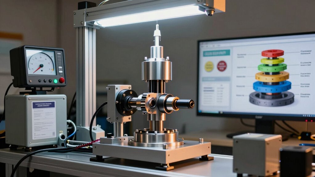
Hub dynos cost £37,995–£145,000+, but most shops ignore the hidden expenses that determine real profitability.
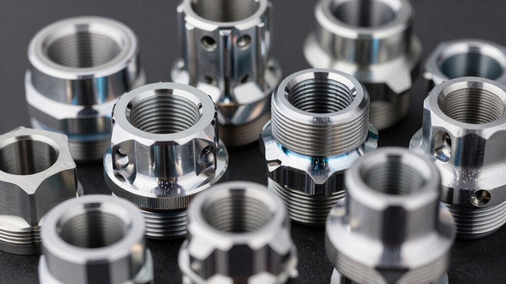
Most drivers ignore this critical bolt pattern detail—and pay the price with wheel failure.
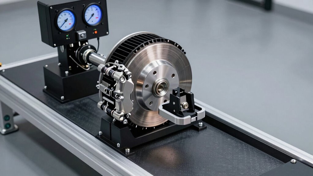
Roller dynos are dangerous for high-HP vehicles. Hub dynos eliminate tyre failure risks—but shops resist the switch. Here’s why.
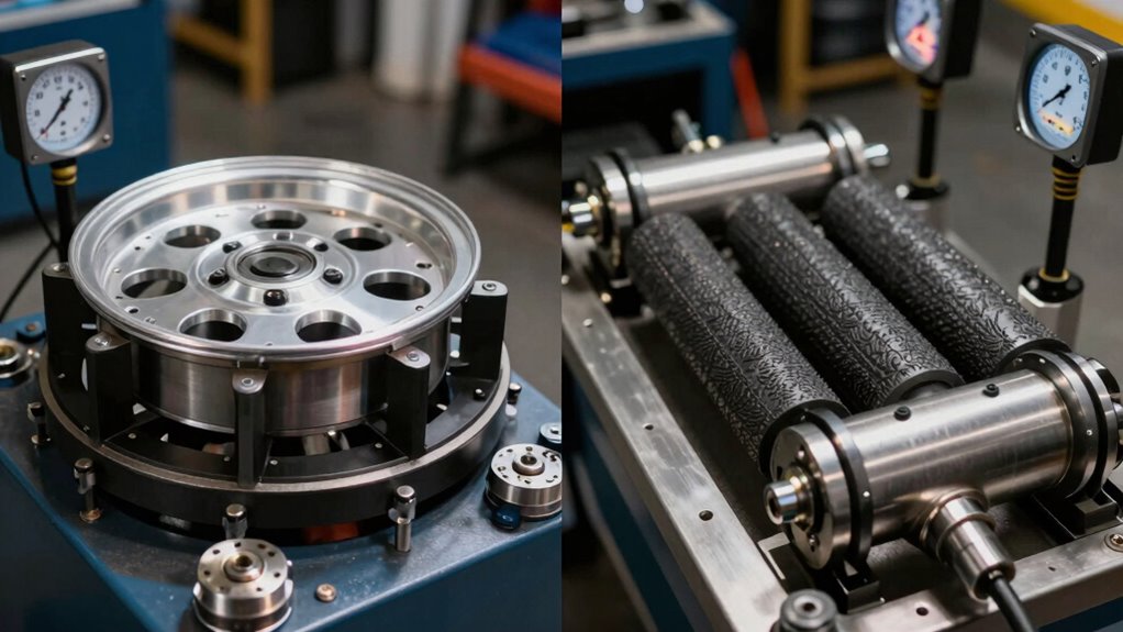
Hub vs. roller dyno: Which one is misrepresenting your car’s true power? A 6% difference changes everything.
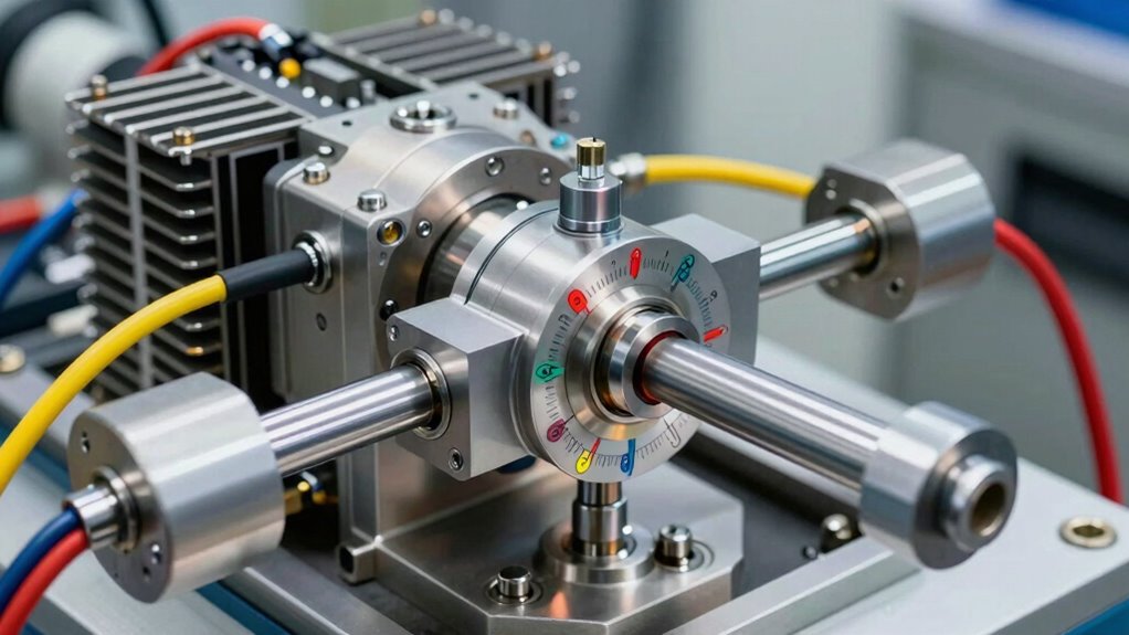
Engine performance testing separates industry leaders from competitors. Learn why most manufacturers miss critical weaknesses before field deployment.
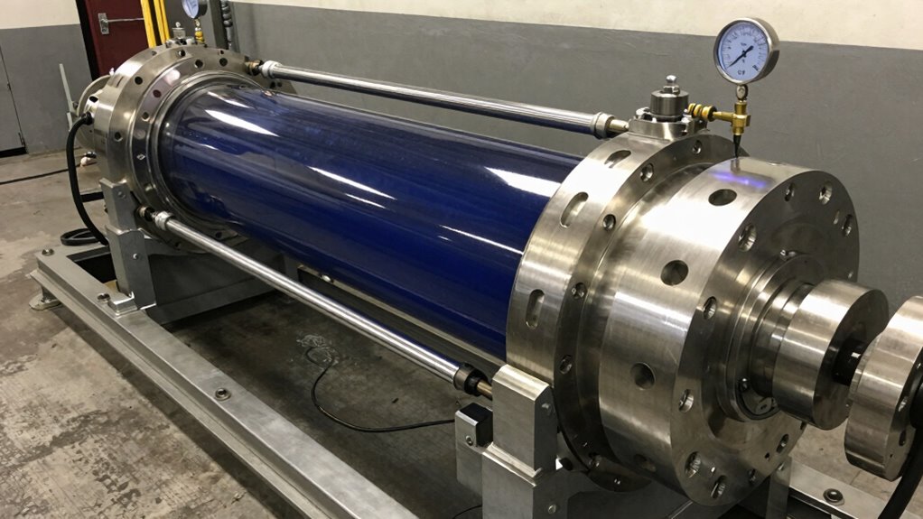
Hydraulic dynos prevent catastrophic field failures—but most heavy industry operators still skip this critical step. Learn why.
Most diesel dyno operators ignore this—and it costs them thousands in failed runs and wasted data.
